Revitalize Your Home with Summer 2025's Trending Colour Palettes
Jun 12, 2025 | Carpet One Floor & Home
Summer is a season of transformation and renewal. Its vibrant hues, soft breezes, and golden sunlight inspire us to reimagine our living spaces, infusing them with an uplifting energy. Whether you're planning a major maximalist overhaul or making subtle decor changes, incorporating this year’s trending summer colour palettes can turn your home into a summer sanctuary.
From discovering the perfect butter yellow to experimenting with elegant shades like dusty blue and dusty red, this guide will help you create a cohesive and refreshing interior design that reflects the beauty of the season.
What Defines a Summer 2025 Colour Palette?
Summer 2025’s trending colours blend serenity and vibrancy, drawing inspiration from nature's rhythms and textures. Imagine a butter-yellow sunset, a dusty blue sky, or the rich drama of eggplant purple. These palettes encapsulate both tranquillity and boldness, making them perfect for personalizing your home.
Key Characteristics of Summer 2025 Palettes
- Vibrancy with Balance
Lighter tones like butter yellow and dusty blue infuse a sense of calm, while deeper hues like eggplant purple and dusty red bring energy and depth. - Natural Inspirations
These shades evoke the beauty of breezy summer fields, sunny beaches, and earthy landscapes. - Trend-Forward Yet Timeless
Summer 2025 colours carry a contemporary edge while retaining their classic versatility.
Trending Summer Colours for Interiors
These are the colours set to define summer interiors this year:
- Butter Yellow
Versatile and cheerful, butter yellow is having a moment. It works as a vibrant accent or a grounding base, ideal for kitchen cabinetry, living room accents, or even playful bedroom decor. - Dusty Blue
Subtle and sophisticated, dusty blue mimics the serenity of twilight skies. It’s perfect for walls or textiles, creating a calming atmosphere in living rooms and bedrooms. - Eggplant Purple
Dramatic and luxurious, this hue adds a sense of elegance and intrigue. Consider eggplant purple for feature walls, statement furniture, or even soft furnishings like curtains and rugs. - Dusty Red
This grounded, muted red brings warmth and earthiness to any room. Use it to add pops of colour through decorative accents or to anchor a dining room with bold paint or upholstery.
How to Use Colour Trends at Home
Not sure how to integrate these stunning colours into your space? Here are a few strategies:
1. Assess Your Space
Observe the tones already present in your home. Complementary colours like butter yellow and dusty blue can soften cool interiors, while eggplant purple and dusty red can enhance warm spaces.
2. Introduce Accents
Even a small splash of trendy colours can make a big impact. A butter-yellow vase or dusty blue cushions can brighten a room. Similarly, a set of eggplant bedding adds richness without overwhelming a neutral palette.
Use the 60-30-10 Rule
Balance your chosen colours by assigning:
- 60% Dominant Shade (e.g., dusty blue walls)
- 30% Supporting Shade (e.g., butter yellow furniture)
- 10% Accent Shade (e.g., eggplant purple decor)
Bringing Summer Colours into Every Room
Each room can reflect various facets of summer 2025’s palette:
- Kitchen
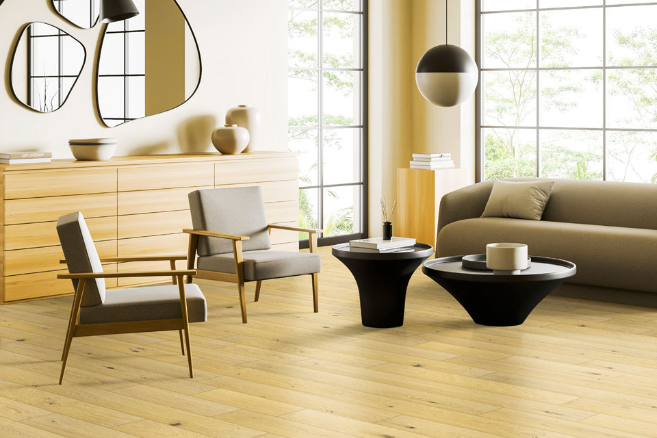
Butter yellow paired with natural finishes infuses warmth and positivity. Consider painted cabinets or colourful kitchenware to create a sunny ambiance. - Living Room
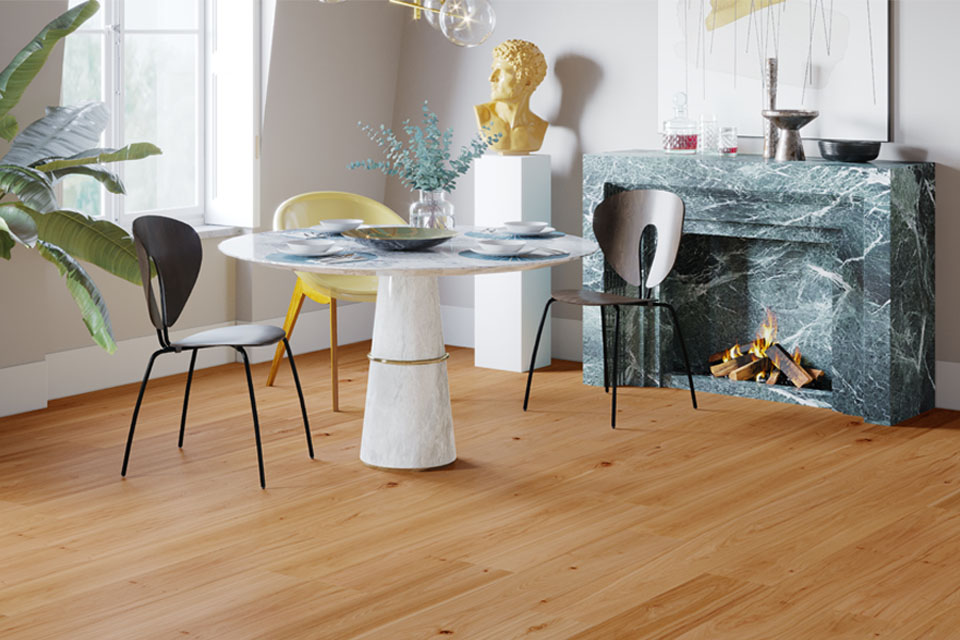
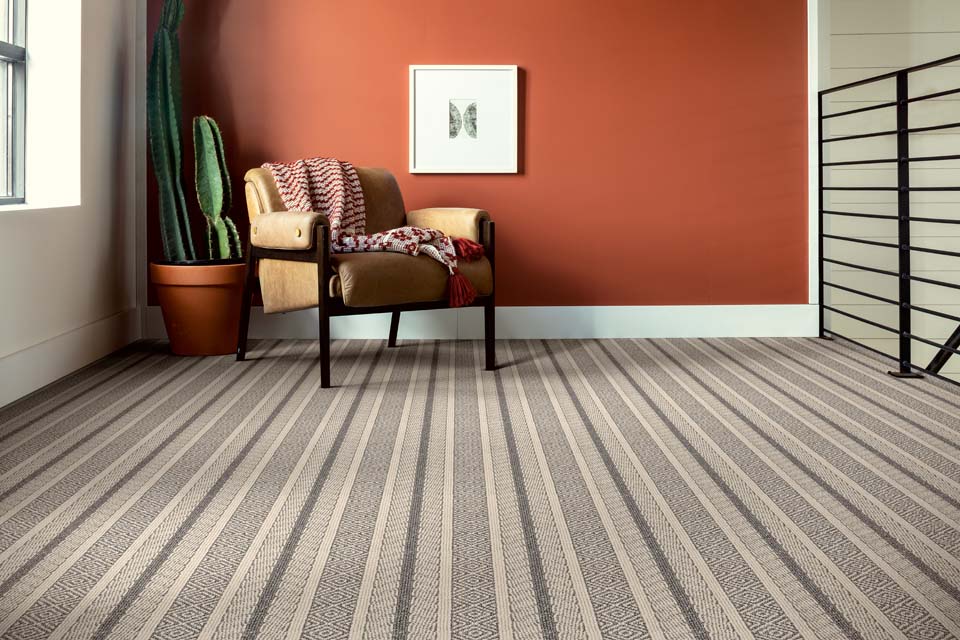
Dusty blue walls combined with accents of eggplant purple and dusty red create a rich, layered look. Add patterned throw pillows and textured rugs or patterned carpet for contrast. - Bedroom
Cozy up with soft, muted tones. Layer dusty blue and dusty red bedding with white or neutral undertones for a serene retreat. - Bathroom
Transform your bathroom into a spa-like space with dusty blue tiles or eggplant purple accents. Butter yellow can be introduced through towels or accessories for a lighter touch.
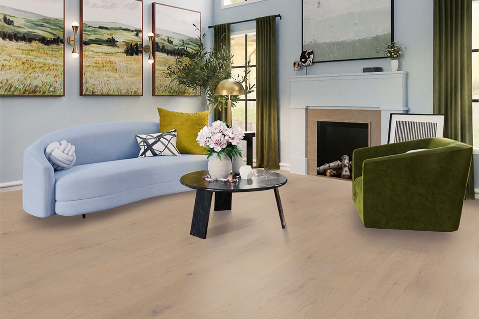
Reimagining Floors with Colour
Your flooring can provide the essential foundation for your interior design. Light wood tones or neutral carpets work beautifully to ground bright summer hues. Thinking about a change? Use our Room Visualizer to explore which flooring options complement your walls and decor perfectly.
Make This Summer Your Most Stylish Yet
Summer may be short, but its vibrant energy can live on in your space all season long. With the perfect blend of colours and design, you can transform your home into a bright, inviting sanctuary that captures the beauty and spirit of summer.
Order your sample box, explore designs with our Room Visualizer, or connect with us today and bring a touch of Summer 2025 into every corner of your home!